Growth Marketing Insights: Part 2.
Table of contents
- NN/g report: what changed in how people read and engage with online content
- Best UX practices to increase the conversion rate of ecommerce stores
- Multi-Product landing pages
- Animated GIFs in Email Are Worse Than Static Emails
- Hypeddit for great music you can use in your ads and product videos
If you prefer watching over reading.
This article is also available as a YouTube video
NN/g report: what changed in how people read and engage with online content
Their previous report which was published almost 15 years ago established a lot of UX practices which defined the modern Internet.
A few highlights.
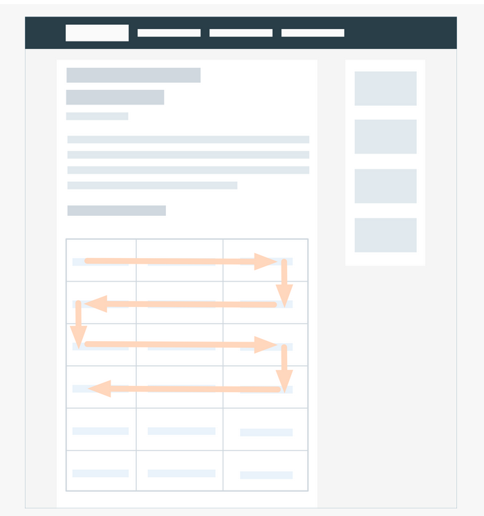
In 2020 people expect your web pages to be long so a new reading pattern emerged. Webpages with zigzag-shaped layouts are read or rather scanned in the “lawn mower pattern”. So it's a good idea to make sure your landing pages are good for quick scrolling. Think about it if you choose between grouping for example the features of your product into tabs or list them one after one.
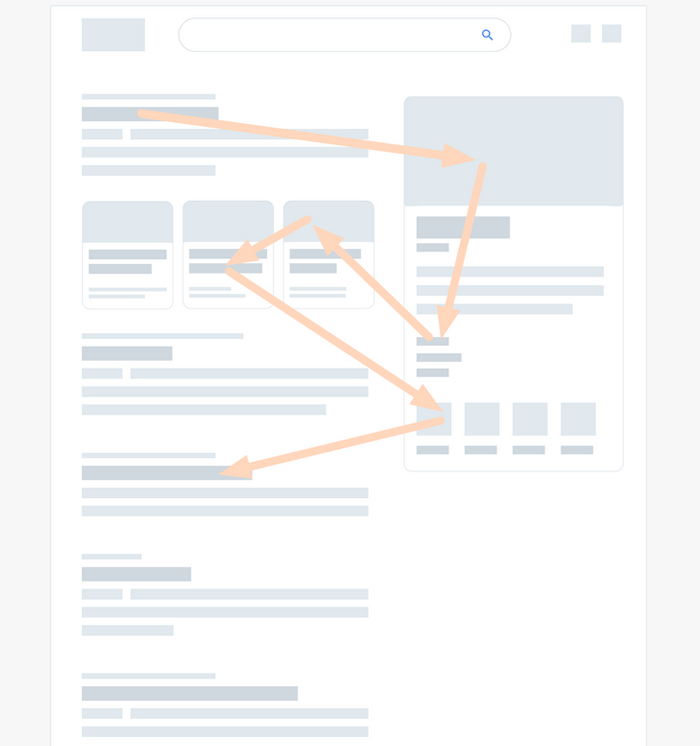
Another highlight is huge for SEO and Paid Search Ads. Search results page is scanned in the “pinball pattern”. It's called “pinball” because users attention is heavily bouncing between different elements of the SERP page. The knowledge graph and Ads are in the spotlight while the top organic spots get significantly less attention than they used to.
What hasn’t changed? People still scan, rather than read. So design your pages that they're easy to scan. Consider using:
- Clear headings
- Plain language
- Visuals that complement the headings
- Comparison tables, bulleted lists, quotes
Best UX practices to increase the conversion rate of ecommerce stores
Baymard Institute published a report on 18 common pitfalls that significantly hurt the conversion rate of ecommerce stores.
Some highlights:
- 72% of ecommerce stores Don’t Make ‘Guest Checkout’ the Most Prominent Option. If “guest checkout” is not present or hard to find you end up losing a significant fraction of your potential customers.
- Way too strict password rules cause up to 19% of checkout abandonments. Despite what you've heard, 6 lowercase letter password is strong enough in most cases. 26 ^ 6 = 308915776 variations.
- 20% of ecom stores don't display the password requirements upfront. Trial and error process is extremely frustrating especially on mobile.
- When entering shipping details most ecom sites use “Delivery Speed” Instead of “Delivery Date”. No one cares about the delivery speed, the only concern your customers have - the exact date and time they receive their goods.
- You credit card form must be flawless. Use “Luhn Validation” to prevent errors in typing the credit card number. Autoformat spaces. Match the credit card field sequence to the physical card sequence.
Multi-Product landing pages vs single-product pages
Ecommerce stores might benefit from utilizing different landing pages for Paid Search (e.g. Google Shopping ads) and Paid Social (e.g. Instagram ads). The difference in the conversion rate might be epic.
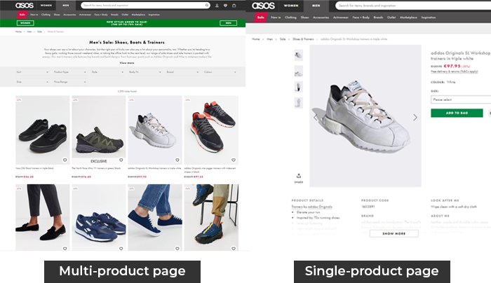
Single-product pages (which is your regular landing page focused on pitching the value of your product) perform much better on Paid Social.
But if you run Paid Search campaigns you should test multi product pages. Think of a multi product page as a succinct category page or a search results page. Three crucial components of a good multi product page include:
- Page contains other products.
- Products are above the fold.
- Products are related to search.
Animated GIFs in Email Are Worse Than Static Emails
Despite what you've heard animated GIFs in email are worse than static emails. Recent NN/g's qualitative study shows that adding a GIF to an email decreases the positive sentiment towards that email by 165%. Not surprisingly GIFs in emails increase the negative sentiment and cause frustration.
Note that during this study the researchers didn't measure the conversion rate yet it's unlikely that getting your prospect annoyed is the proper way to increase the CR.
Hypeddit for great music you can use in your ads and product videos
Most free-to-use music is boring and generic. And even If you somehow found a piece that's cool it's most likely already been used by a lot of people. However there are a few gems in the world of free or almost free-to-use music and one of them is HYPEDDIT . HYPEDDIT is a marketplace of talents willing to give you their music in exchange of Soundcloud likes, social shares and sometimes mentions. So it's basically for free. Keep in mind that even though the quality of tracks is usually above average be ready to spend at least an hour to find a few suitable tracks.